TLDR;
Facebook Marketplace undertook a comprehensive redesign and rebuild of their blog to better accommodate diverse content categories and prepare for future growth. As part of this initiative, the team restructured the entire blog's navigation system, focusing on improving user experience and accessibility. The new navigation framework was strategically designed to cater to a broader audience by ensuring that content is easily discoverable across various categories, ultimately enhancing the blog's appeal and engagement.
The Ask
Facebook Marketplace embarked on a phased redesign and rebuild of their microsite, with a specific focus on enhancing the blog experience. The project required the creation of a new, dynamic landing page for the blog's homepage, designed to offer a more engaging entry point for users.
Project Overview
Redefining Existing Components
The Facebook Marketplace team sought to revamp their existing components by adopting modern standards and incorporating industry best practices for user experience. This initiative required a fresh approach that aligned with contemporary UX trends while maintaining consistency with Facebook's overall design philosophy. To achieve this, we collaborated closely with the creative team to ensure our designs were not only innovative but also seamlessly integrated into Facebook's Design System, providing a cohesive user experience across the platform.
Collaborating with Out-of-House Development
The development of the blog was handled by a third-party agency, which necessitated the creation of comprehensive documentation to ensure a smooth handoff. Our goal was to implement a new approach to existing components, emphasizing clarity and precision in our documentation to facilitate the agency's work and ensure the final product met Facebook Marketplace's high standards.
Restructuring Content Hierarchy
To better serve the current audience and prepare for future growth, we reimagined the content hierarchy of the blog. The new structure was meticulously designed to enhance user experience by making navigation intuitive and user-friendly. By reorganizing the blog's navigation, we aimed to make it easier for users to find relevant information quickly, thus improving overall engagement and satisfaction. This strategic restructuring positioned the blog for long-term scalability and adaptability as content needs evolve.
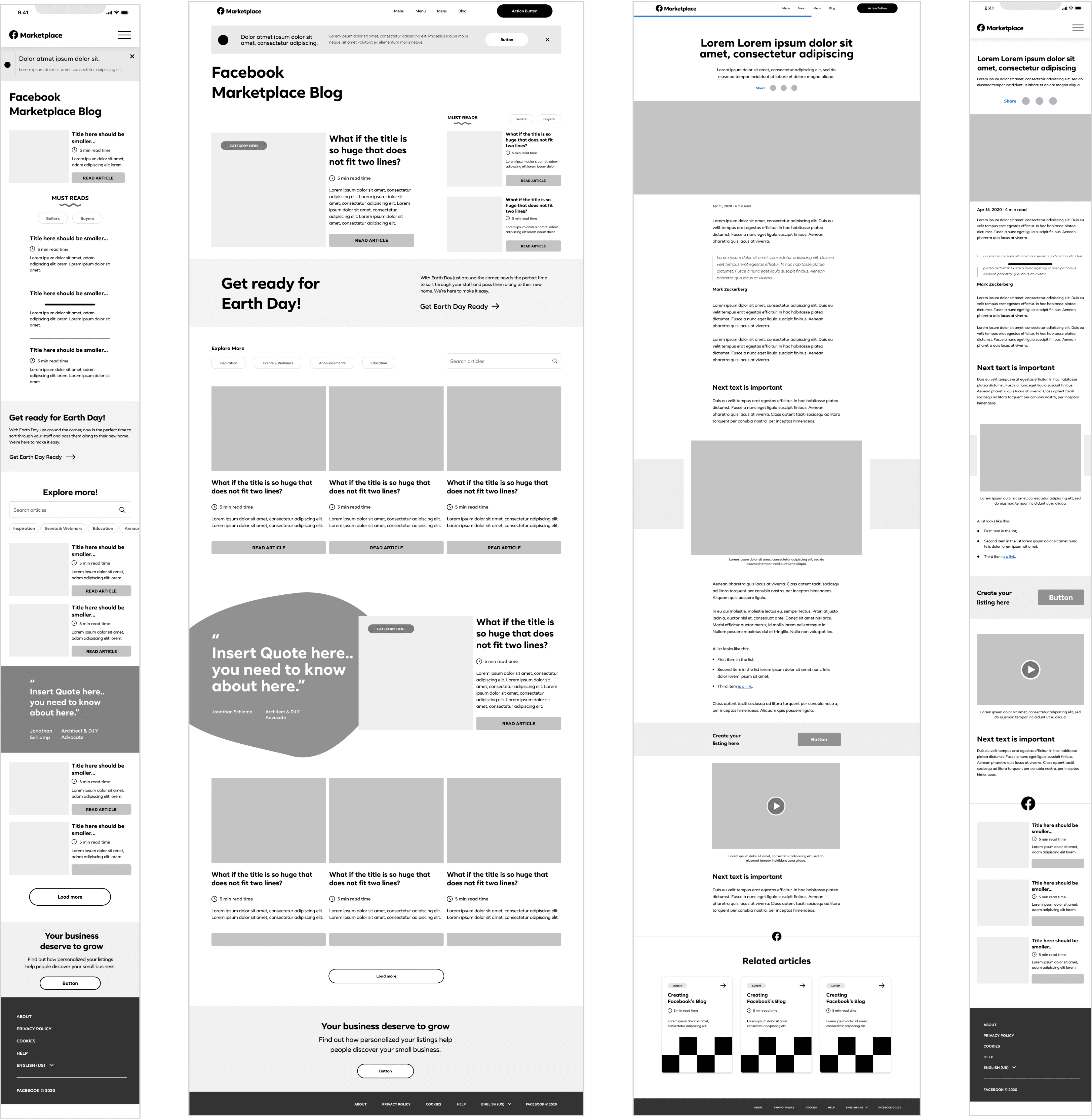
Mid-Fidelity Wireframes
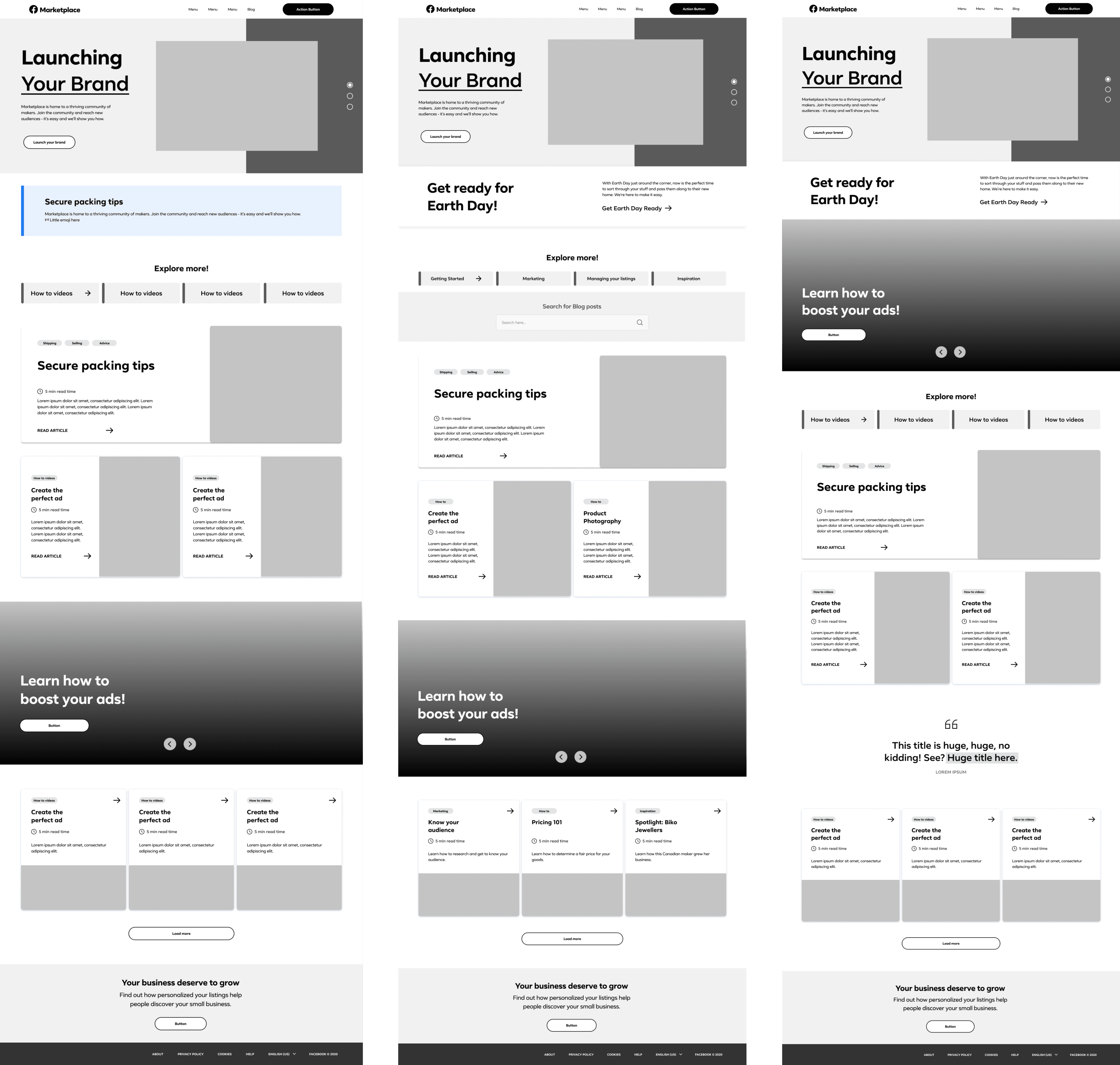
As part of the Facebook Marketplace Blog redesign project, I created wireframes to illustrate the new Landing Page for the Blog homepage and the adaptable blog detail page. These wireframes served as a preliminary visual blueprint, focusing on the layout, structure, and key interactions without delving into detailed design elements. By providing a clear representation of the proposed user flow and functionality, the wireframes allowed us to effectively communicate our vision for the new blog pages. This early-stage visualization was crucial for gathering feedback from stakeholders, enabling us to make informed adjustments and refinements before advancing to the detailed design phase.
High-Fidelity Wireframes
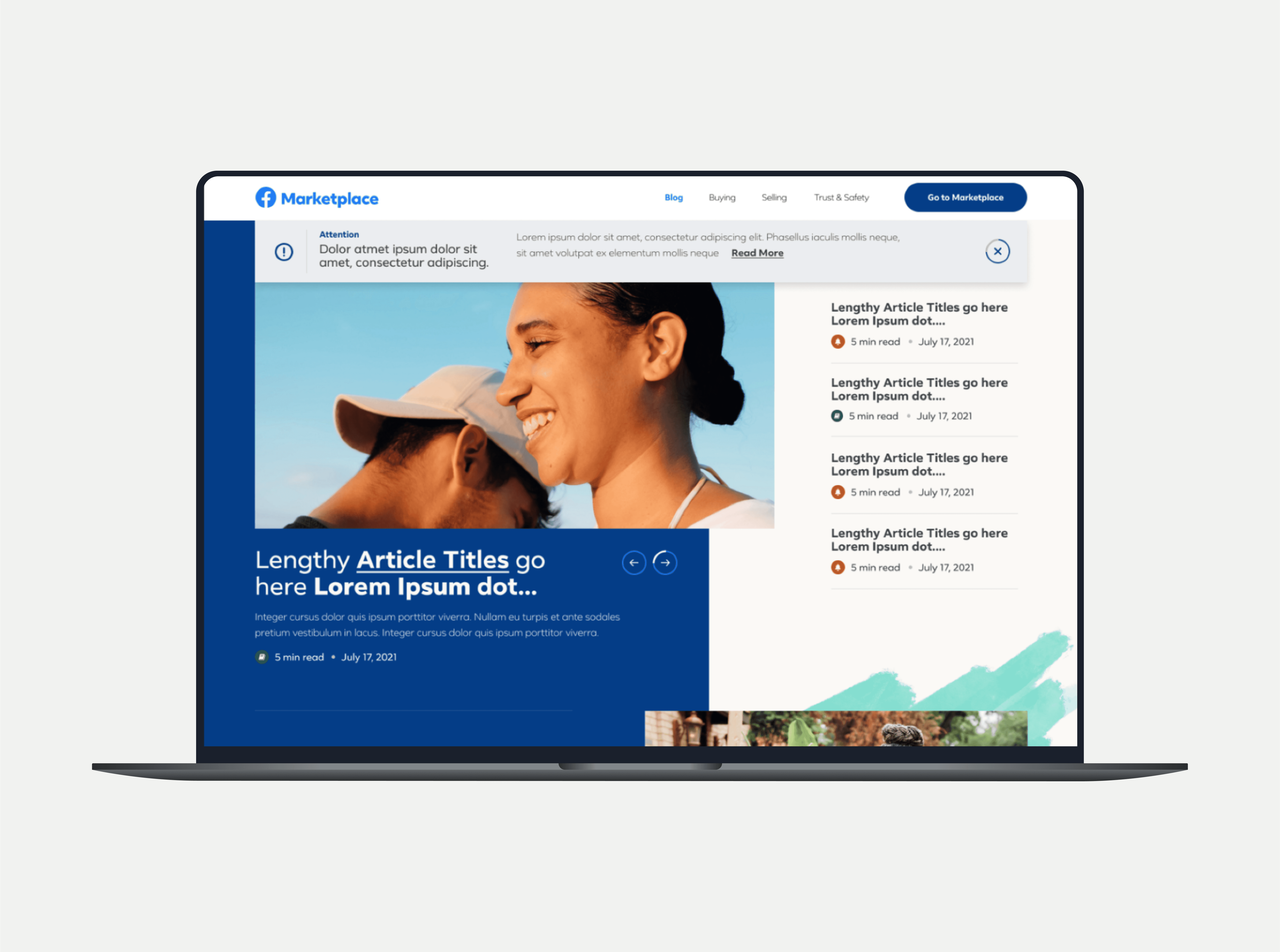
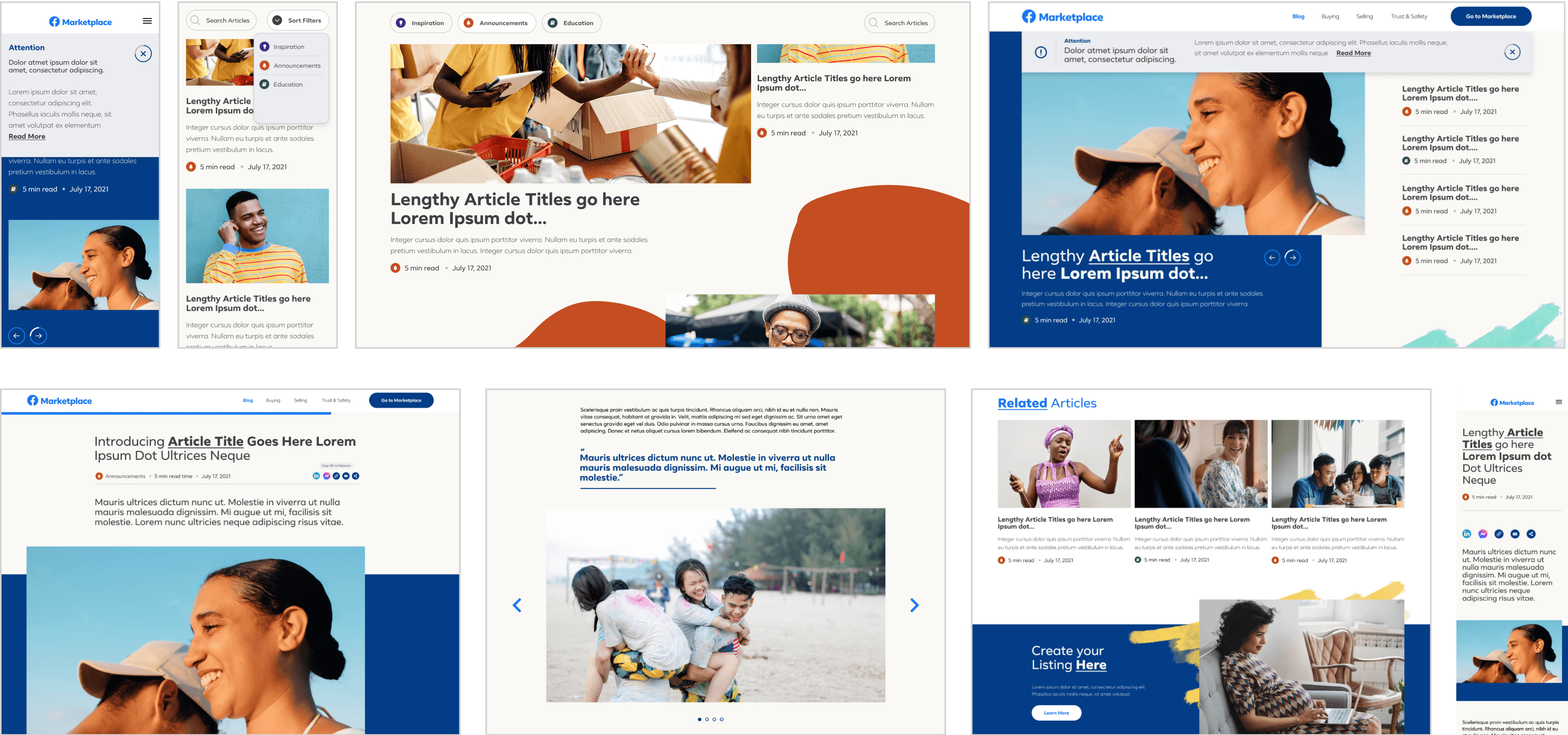
Following the approval of the Content Hierarchy outlined in the Mid Fidelity Wireframes, we progressed to the High Fidelity Wireframes phase. Drawing on my expertise in existing components and integrating insights gained from benchmarking other blogs and industry best practices, I developed and presented the following design above.
The Results
In close collaboration with the Creative Designer, we developed a series of design concepts that aligned with the strategic goals of the Facebook Marketplace Blog redesign. Our approach was deeply informed by Facebook's existing documentation and Design System, ensuring that our designs not only adhered to established guidelines but also pushed the boundaries of creativity within those parameters. By leveraging these resources, we were able to create concepts that were both innovative and consistent with Facebook's brand identity.The implementation of the redesigned Blog is being carried out in a phased approach, allowing for iterative testing and refinement of each stage before full deployment. This methodical process ensures that each element is thoroughly vetted and optimized for user experience. The project is on track for completion by November 2024, at which point the new Blog will be fully integrated and live, offering a seamless and enhanced experience for users.
Design Handoff and Specs
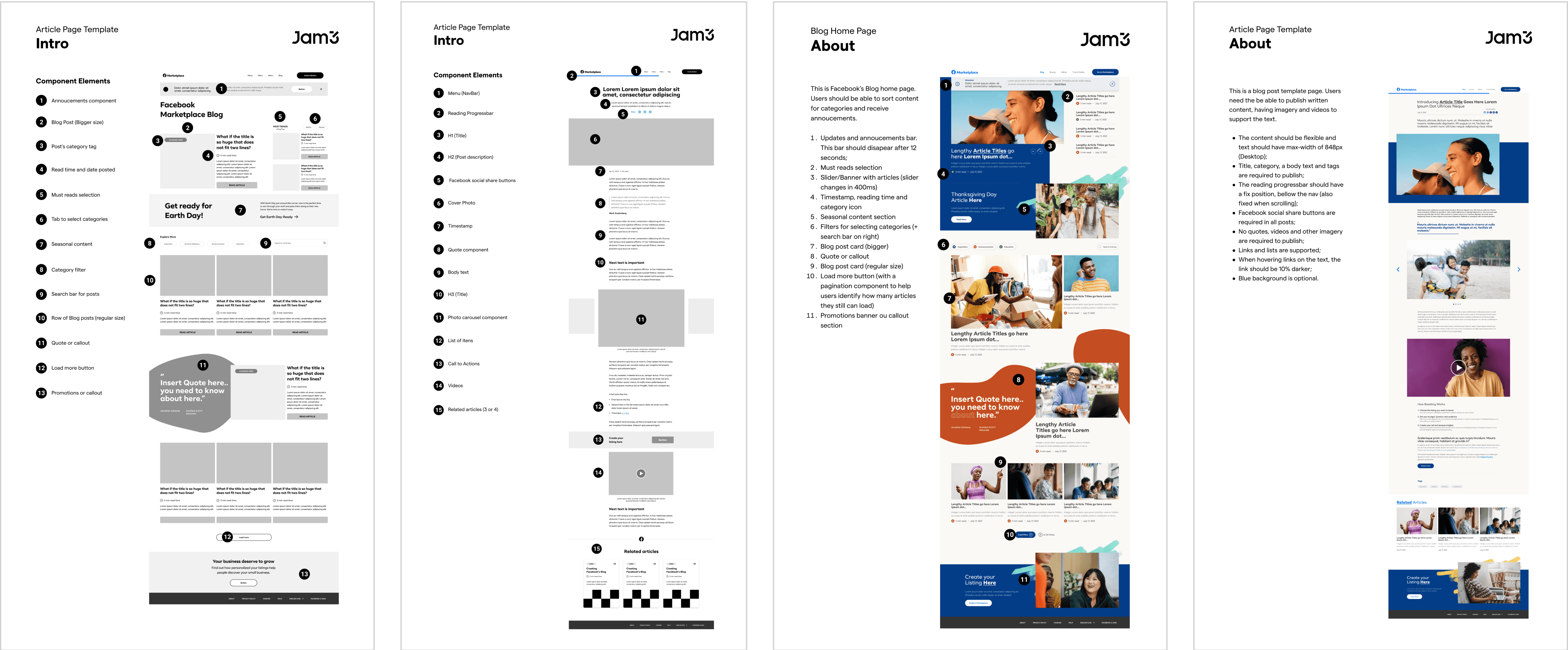
To ensure clear and precise guidance for the external development team, the Creative Director and I prepared a detailed design specification document. This document included a comprehensive component library, where each component used in the redesigned blog pages was cataloged and annotated. We provided specific details on the behavior, functionality, and interaction patterns of each component, along with guidelines for layout, typography, and responsiveness. This thorough documentation aimed to eliminate ambiguity, streamline the development process, and ensure that the final implementation aligned closely with our design vision.
