The Ask
The Responsible Gambling Council (RGC) assists individuals in understanding the risks associated with irresponsible gambling. In Canada, eligibility to participate in gambling activities is contingent upon meeting certain criteria. RGC aimed to communicate a crucial message: possessing extensive skills or knowledge about a particular game does not guarantee winning outcomes. Regardless of expertise or frequency of play, numerous factors influence the chances of winning or losing. The project was segmented into two distinct experiences: the Event Experience, targeted at university students during a specific event, and the URL Experience, accessible to the general public.
My Role on the Project
In collaboration with Alpha Zulu Kilo, a Toronto-based creative agency, I was responsible for designing the user experience based on provided scripts and reference materials. Additionally, I served as a UI and Figma consultant, advising the agency on best practices in Figma for component building and managing theme changes. These theme changes were crucial for tailoring the interface to resonate with different audience personas. My role was also to serve as an advisor for best practices and help the designers navigate Figma more effeciently and quickly.
Using the Bias of Illusion of Control
Gamblers who are confident in their skills or knowledge might gamble more often, wager larger amounts, or choose riskier bets due to their belief that they can control or predict outcomes—a belief often stronger than the reality of the situation. Given the popularity of The Snake Game, we chose to leverage this game to underscore our point about the unpredictability and random nature of gambling outcomes.
User Flows
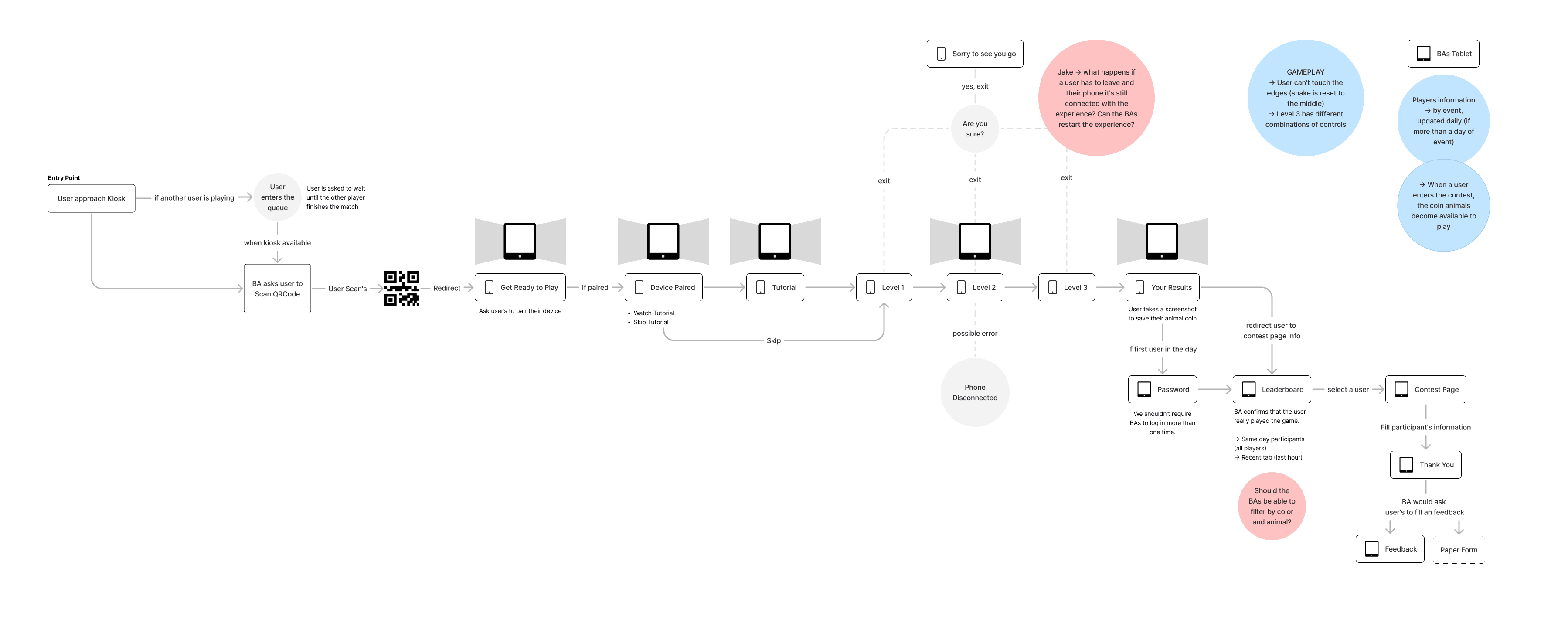
To anchor our discussions and strategy, I developed comprehensive user flows. These flows were instrumental in mapping out user interactions with the interface, facilitating screen navigation during client meetings, and validating key points of the user experience. They also provided a framework for addressing development and design queries, ensuring alignment with the project's goals.
Event User Flow (Tablet device)

General Audience User Flow (Mobile/Desktop devices)

Game Mechanics
That were specific gaming mechanics into place. The objective of the randomizer was to increase the difficulty but stimulating the players to keep it in the game (as in the results page is where we prove our point and revel your results). I had to study game pacing, common mechanics for the game that would influenciate the final result, such as:
Core Gameplay Loop: The core mechanic of a snake game is straightforward: the snake moves in a grid, eats items (typically apples), and grows in length with each item consumed. The game ends when the snake collides with itself or the boundaries of the play area. As the levels evolved, the game would become harder and harder to control.
Progressive Difficulty: As the snake grows longer, maneuvering it becomes increasingly difficult. This naturally raises the game’s difficulty level as progress is made, providing a good balance of challenge and skill. Considering ways to scale difficulty was crucial, such as increasing the speed of the snake or adding more obstacles as the player advances.
User Interface Simplicity: The UI should be minimalistic and clear, displaying only essential information like the current score, high score, and perhaps the length of the snake. This would help to keep the player focused on the gameplay.
Control and Responsiveness: The controls should be simple (usually arrow keys or swipe gestures) and highly responsive. As the game progress, we would shift the control areas, making it increasingly difficult to achieve good results.
Wireframes
Upon completing the User Flows we quickly moved to wireframes. During this phase, our focus extended to several key pages that required meticulous attention, especially the creation of a Landing Page (LP) designed to host the online game accessible to the general public.
For the student-focused version, the wireframes featured vibrant colors and clear guidance cues for event hostesses who were responsible for distributing tablets. This setup was not self-service; instead, hostesses needed to manage waiting lines and securely store user information post-game for those who wanted to enter a contest to win free tuition for the next semester. In contrast, the public version of the LP emphasized streamlined engagement, using more subdued colors and simplified access to ensure immediate gameplay. This design was aimed at capturing and retaining the interest of a broader audience.
The General Audience Desktop experience had to account for a device change as the users could only play the experience using their mobile phones as a controller. This was a fun and engaging way to keep the game mechanics preserved across multiple devices (tablet, desktop and mobile).
Throughout the wireframing process, each design decision was tailored to meet the distinct needs and behaviors of these two audiences. This dual-strategy approach not only enhanced user experience but also supported RGC’s objective of promoting broad educational outreach about the risks associated with irresponsible gambling.
Event User Flow (Tablet device)

General Audience User Flow (Mobile/Desktop devices)

Game UI
The final Game UI emerged as a harmonized blend of aesthetics and functionality tailored for our distinct audience segments. Here's a closer look at how these designs materialized into engaging user interfaces:
Young Audience/Event Version: The UI for the student-focused game is vibrant and interactive, employing a palette of bright colors to captivate and engage the younger audience. Each element on the screen was crafted to facilitate ease of use by the event hostesses, from clear, bold guidance cues to intuitive navigation controls. The interface supports hostess-led interactions, where they assist students in navigating through the game, entering contests, and managing participation seamlessly during the event. This design not only enhances the experience but also effectively communicates the educational message about responsible gambling.
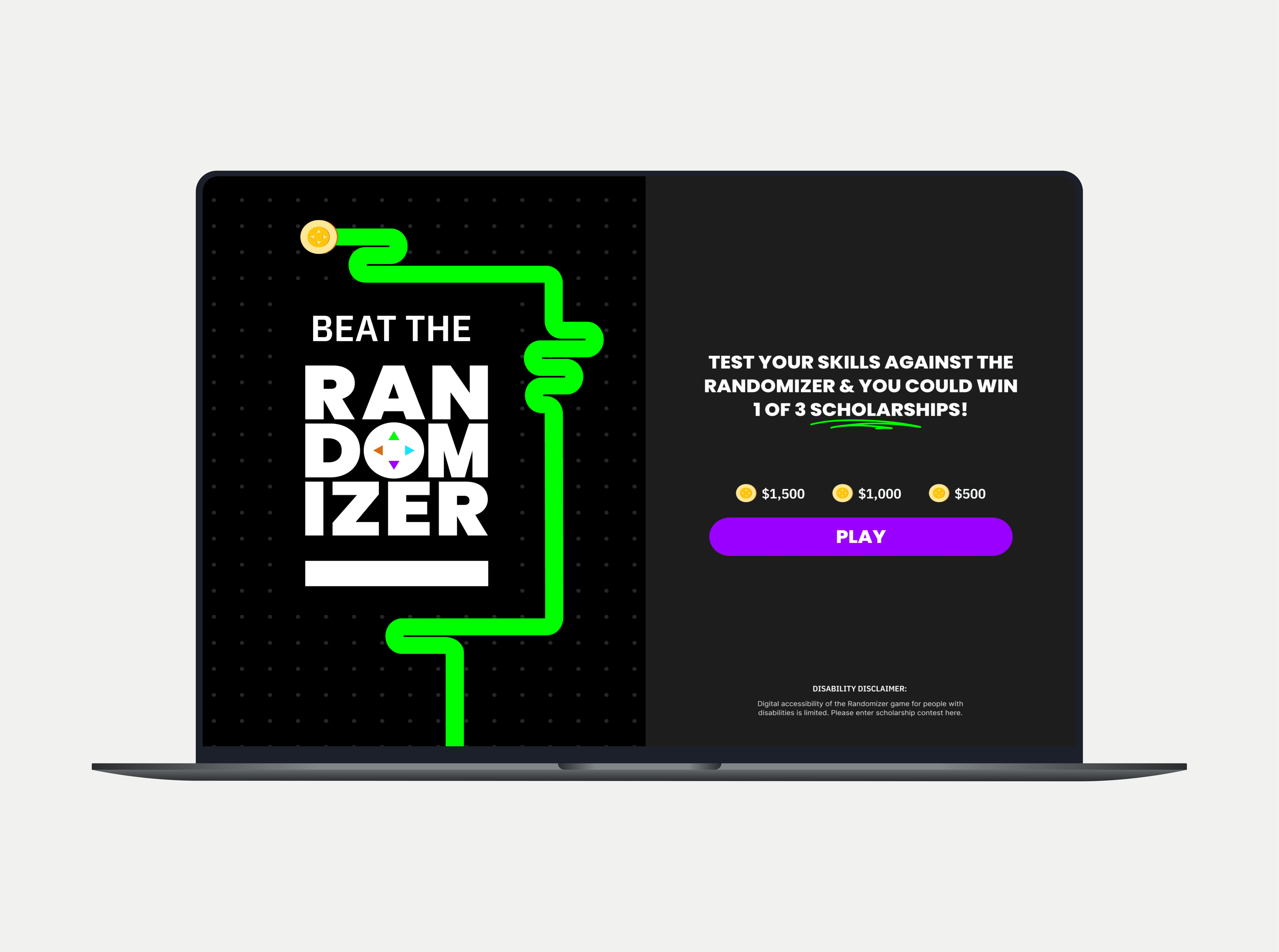
General Public Version: The public version of the Game UI is designed with simplicity and broad appeal in mind, featuring moderate colors that convey a more subdued yet inviting atmosphere. The layout prioritizes straightforward access to the game, minimizing barriers to entry and maximizing engagement from the first click. This version is optimized for self-service, allowing users to dive right into the gameplay without assistance, fostering an intuitive user journey that keeps them coming back.

Local Variables
Theme Creation and Management
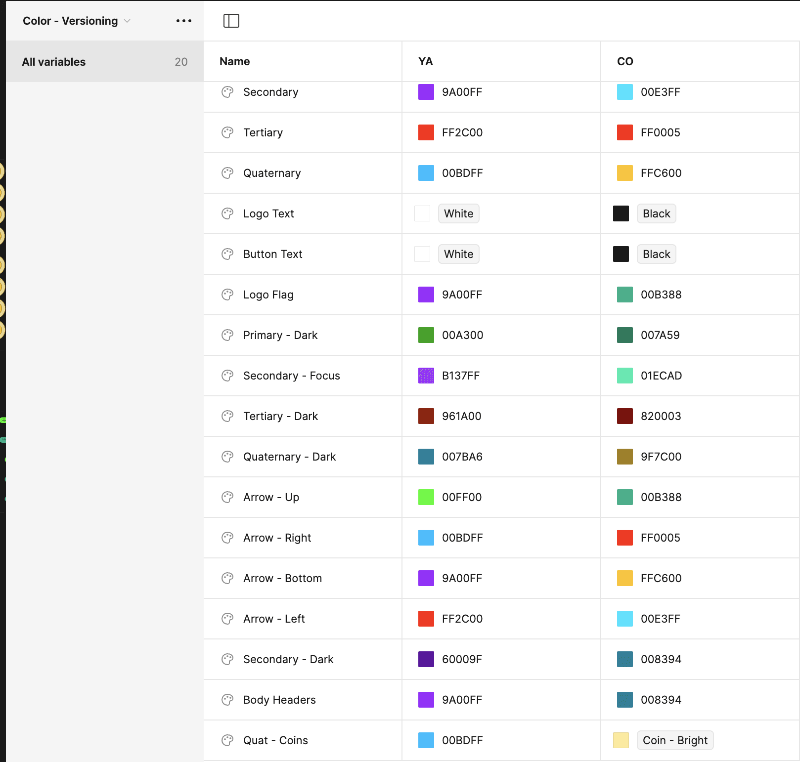
To accommodate the distinct visual requirements of the student and public versions of the game, we implemented a dynamic theming system within Figma. This system leverages local variables to control color schemes, typography, and UI elements across different themes. By setting up these variables, we enabled the design team to switch themes with a single click, transforming the entire UI's look and feel to suit the targeted audience.

Educational Approach
I conducted a meeting to educate the design team on the best practices for creating and managing themes using Figma’s local variables. This meeting covered:
Setting Up Local Variables: Detailed instructions on how to define and apply local variables for colors, fonts, and component properties.
Theme Switching Mechanism: Techniques for implementing a toggle system that allows designers to swiftly switch between themes and instantly see the changes across all applicable designs.
Maintaining Consistency: Strategies to ensure that regardless of theme changes, the design remains consistent in terms of usability and accessibility standards.
Collaboration and Efficiency
The use of local variables significantly streamlined the design process, reducing the time and effort required to test different aesthetic approaches and ensuring consistency across various game components. This system not only facilitated a more collaborative and flexible design approach but also ensured that any member of the team could easily adapt or alter the UI without extensive reworking.


